Creating a new button
Estimated time to complete: 2 minutes
Requirements: An account on NowButtons.com
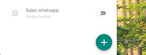
Click the plus
To start a new button, click the circular button with the '+'-sign.

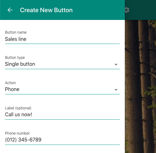
A new button has a few requirements:

Button name
A button name is a label to remind you of the button's purpose. On the main screen you'll see an overview of all your buttons with their names. So a clear name will help you to easily retrieve your button you're looking for.
Button type
By default the Single button is selected here. This is the default circular NowButtons.
There are two additional options: The Multibutton and the Buttonbar. The Multibutton is a single circular button that unfolds into multiple buttons after a tap. The Buttonbar places one or more buttons across the bottom of the screen.
Action
You can select any of the following actions:
- Phone
- Location (address)
- SMS/Text
- URL
- Anchor (link to a specific point on the page)
Action value
The action value is what you want the button to do.
- The phone button, the text or SMS button and the WhatsApp button all need a phone number
- The email button needs an email address
- The location button needs an address
- The Link button needs a website address (incl. http)
- The anchor link needs an anchor
Additional options
There a number of additional button settings that are not required but these give your more control.

Label
The label is a descriptor or call to action that's shown to your visitors. By default your buttons will just have an icon that visualises the button's action. The label will add a label or tag to the button. (Single buttons and Multibuttons will have the label placed next to them. Actions in the Buttonbar will have it added to the button itself.)
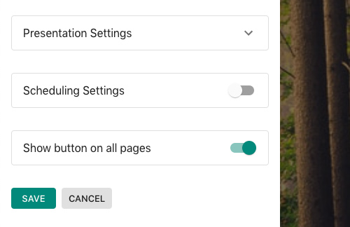
Presentation Settings
This section allows you to control the colors and the positioning of the button on your pages. Options here are:
- Button color
- Icon color
- Icon selection
- Positioning
- Button animation
Scheduling Settings
By default your button is shown constantly. The scheduler allow you to set the days of the week and the times that the button should be visible.
Limit Appearance
Here you set the pages where your button should be shown. There's a couple of different ways to set the page where the button should or should not be displayed. Or a combination of rules.
You can create include and/or exclude rules with one or more of the following options:
- Page path is ...
- Page URL is ...
- Page URL contains ...
- Page URL matches RegEx ...
Saving your button
Once you're happy with the settings click Save to store your button.
Did this answer your question?